This is my first quantitative project at Major Studio 1 during my study at the MS Data Visualization program at Parsons School of Design. The project is in collaboration with The Division for Sustainable Development Goals (DSDG) of the United Nations.
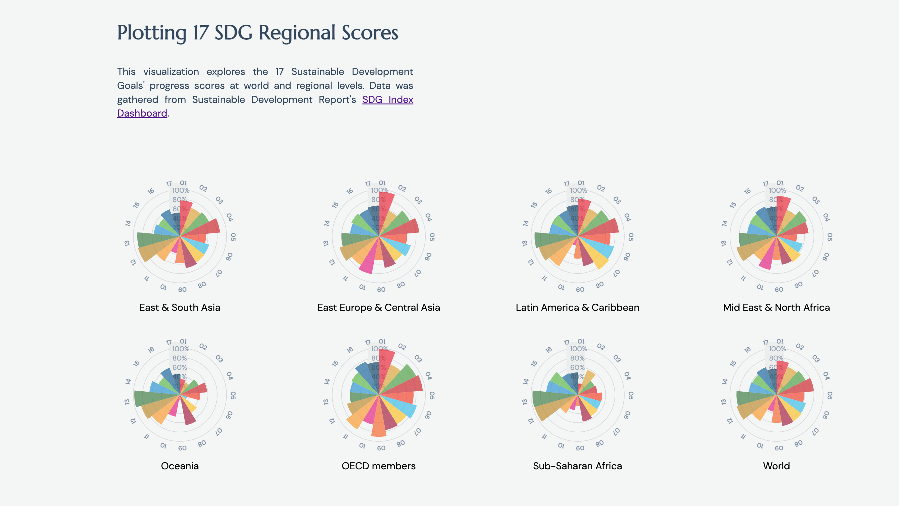
The Sustainable Development Goals (SDGs) are 17 global goals adopted by all United Nations Member States in 2015. They aim to tackle societal, environmental, political, and economic challenges we face as a shared humanity. According to Sustainable Development Report 2022, for the last two consecutive years, the world is no longer making progress on the SDGs. This visualization offers an efficient overview of SDG progress achieved regionally and globally based on SDG progress scores.
A glance at the small multiples reveals significant developmental imbalances amongst different regions, particularly in areas such as equality and environmental actions.
Plotting 17 SDG Regional Scores
Data Visualization
In this dashboard, I explored creating small multiples of the Nightingale chart with a multi-selection tooltip. This reduces any unnecessary interactions and allows users to efficiently filter and decipher information.[Github Documentation]
Tools I used:
- d3.js
- HTML5/CSS